Computing meets Maths and Science in this Cross Curricular Learning
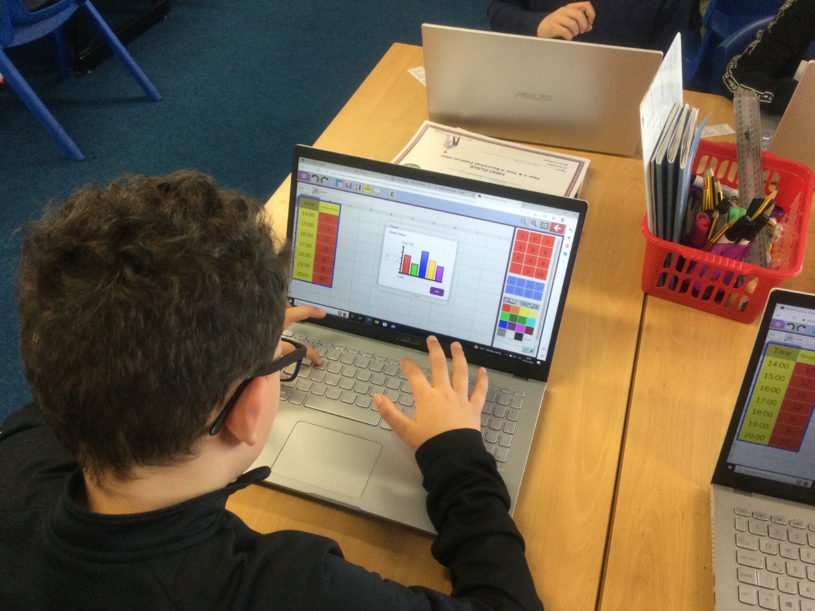
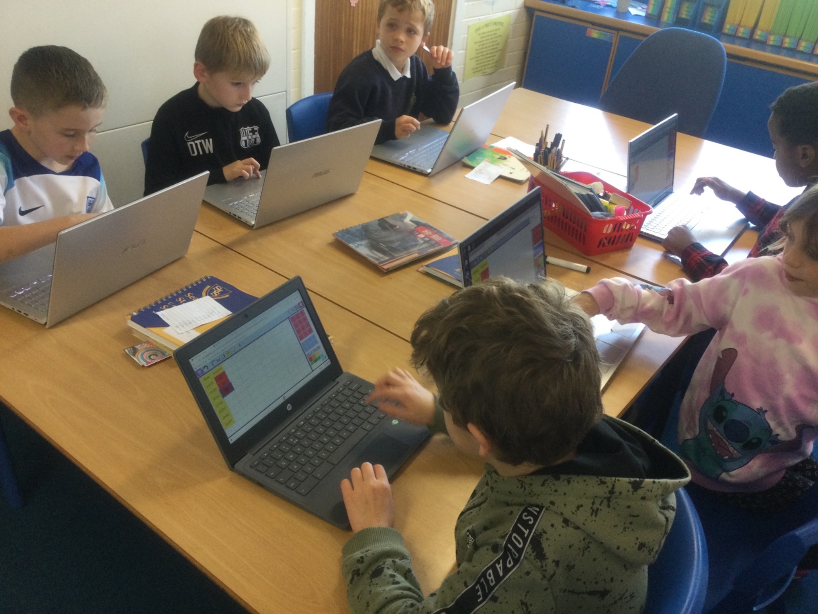
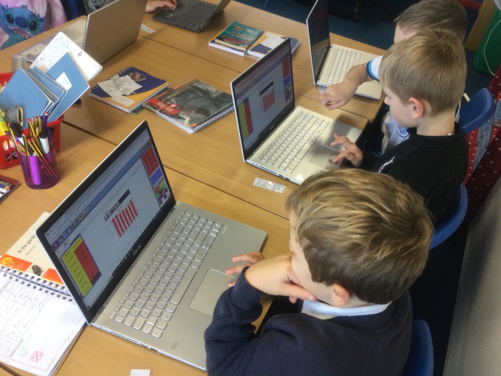
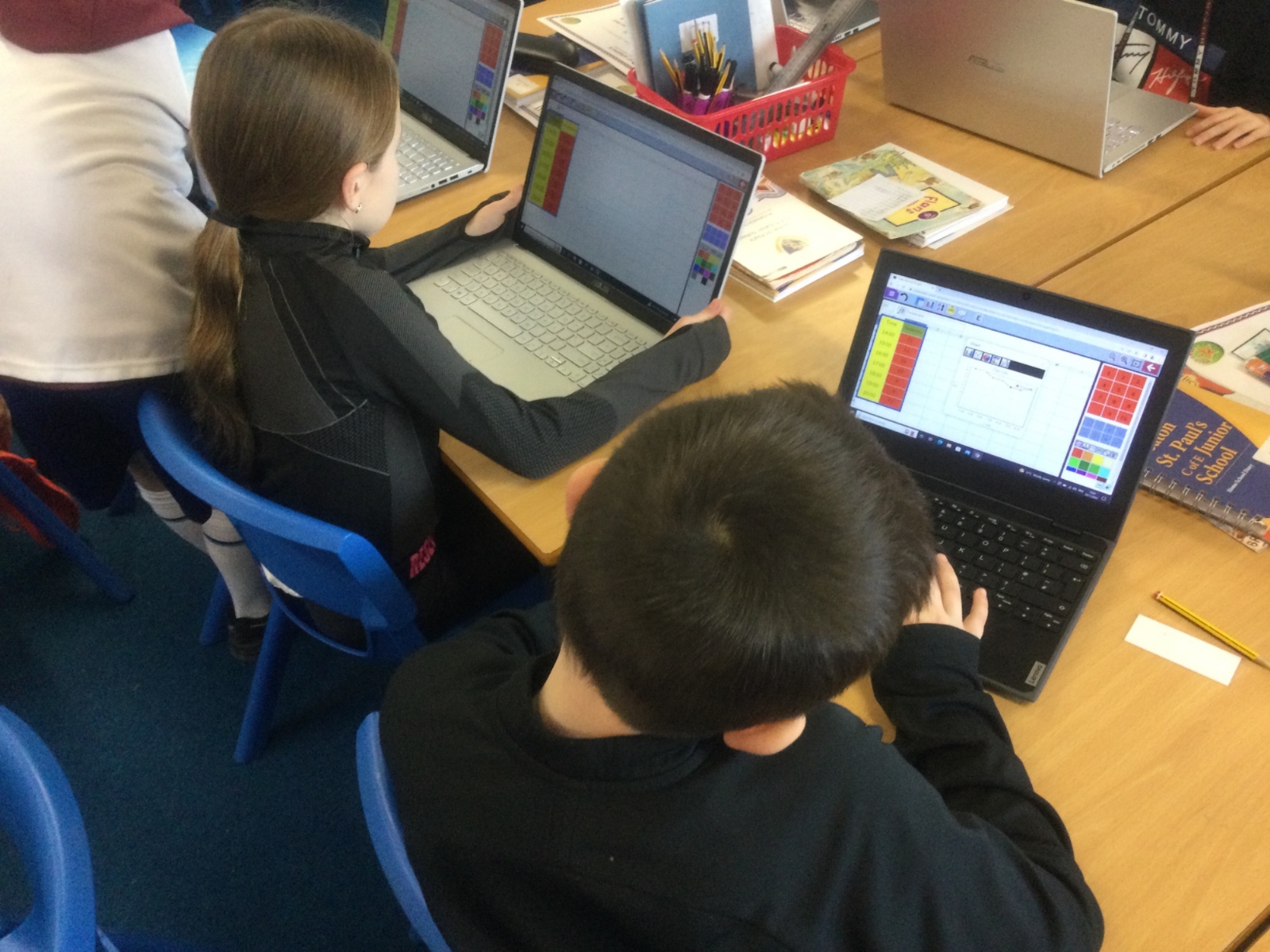
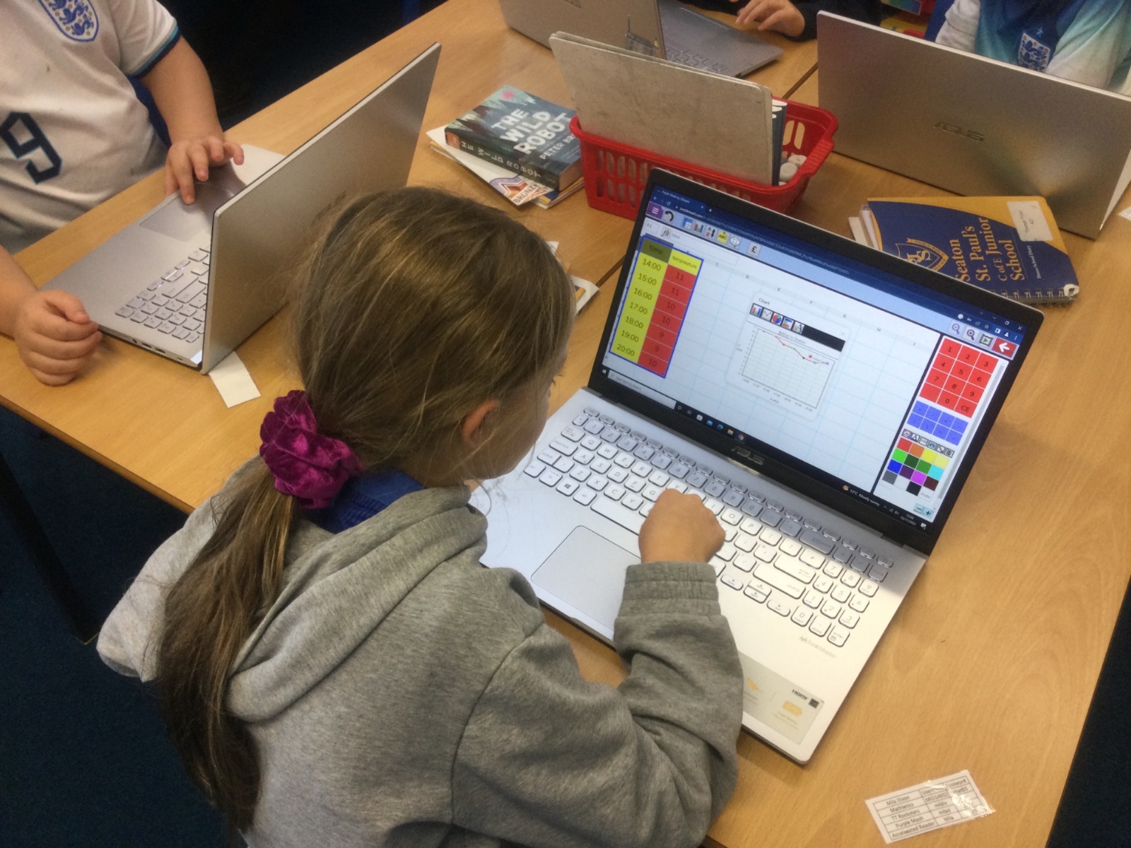
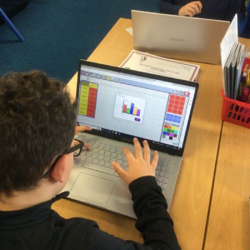
Today we focused on creating bar charts in Purple Mash's version of Excel, we recorded the data throughout the day using thermometers and then inputted it into the spreadsheet formatting it into two columns: time and temperature. Using this data we created a bar chart and answered questions about the data drawing inferences from it, for example what we observed vs what was recorded.
A829CEE8-2594-439F-B198-37B714623293
A829CEE8-2594-439F-B198-37B714623293.jpeg1523A829CEE8-2594-439F-B198-37B714623293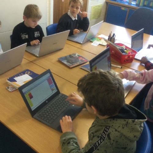
191A9D53-AEE3-4BC3-8720-37BCDC7486D5
191A9D53-AEE3-4BC3-8720-37BCDC7486D5.jpeg1522191A9D53-AEE3-4BC3-8720-37BCDC7486D5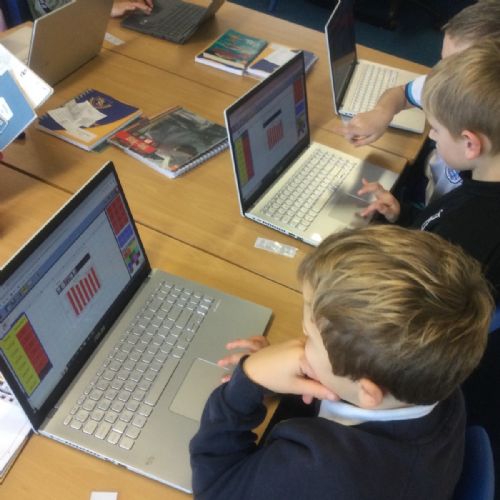
9F841C11-259D-4F58-9F21-AA480F1DD281
9F841C11-259D-4F58-9F21-AA480F1DD281.jpeg15219F841C11-259D-4F58-9F21-AA480F1DD281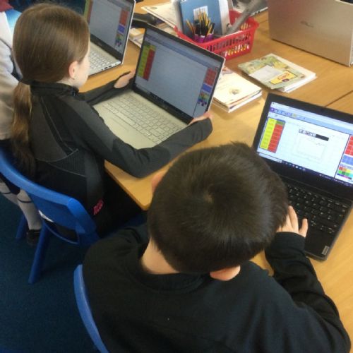
24C8F0F2-DC81-41E6-91E5-3C2325D9393B
24C8F0F2-DC81-41E6-91E5-3C2325D9393B.jpeg152024C8F0F2-DC81-41E6-91E5-3C2325D9393B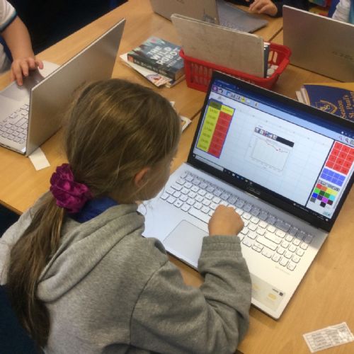
A16DE849-CA67-4B7D-9C05-C483D1D3DB9D
A16DE849-CA67-4B7D-9C05-C483D1D3DB9D.jpeg1519A16DE849-CA67-4B7D-9C05-C483D1D3DB9D